Edusure
An insurance broker designed to help you make more informed decisions about health insurance.
Logistics
Course: INFO 4420 HCI Studio
Team Members: Colton Zuvich & Mengxue Wang
My Role: Product Designer
Abstract
Finding a health insurance plan can be a time-consuming, confusing, and a potentially expensive process since insurance companies do not readily advertise quotes without exchanging one’s contact information. Moreover, finding a plan is only the beginning and many younger patients lack the necessary knowledge to make health-related decisions, especially as it applies to their health insurance plan. In this paper we present Edusure, a digital platform which helps recent graduates learn about the intricacies of health insurance as well as connect them to a plan that best fit their unique needs. The platform is designed with privacy and transparency in mind to allow users to compare plans across a variety of insurance providers as well as help them make sense of their plans.
Introduction
This semester, our team was tasked with developing a design intervention to “make the world a better place.” One area where our team saw an opportunity ripe for innovation was the health insurance industry — based on our confusing and frustrating experiences navigating our insurance plans at Cornell University. Our frustrations with the insurance space went beyond simply finding an insurance plan, but also making sense of the plans we already had.
Previous attempts to reform the United States healthcare system are ongoing and tend to be policy-focused such as the Obama-era Affordable Care Act (aka Obamacare) and recent pushes for programs like “Medicare for All” (i.e. single-payer healthcare system). While healthcare policy in the U.S. is frequently criticized with regard to its shortcomings, given the scope of our class we took the existing U.S. policies as a given and instead focused our efforts on improving the existing system to insure more people.
Specifically, we had three overarching goals for our project:
To connect patients to quality health insurance plans which best fit their unique needs.
Provide a mechanism to sort and compare multiple plans across a set of clear criteria to limit decision-fatigue.
Help patients make sense of important health insurance terminology to best utilize the plans they ultimately select.
In this article, we present Edusure, a personalized health insurance platform that guides users throughout the lifecycle of their health insurance journey. Our digital platform was designed to guide users through the process of selecting an insurance plan, understanding their policy, and learning about how to use their plan such as finding an in-network doctor. We specifically focus on connecting recent graduates that have either migrated off their parents health insurance plans or are currently uninsured — since we found this population tends to be “put off” by the act of finding and purchasing an insurance plan.
User Research
Target Population
We decided to focus our efforts on college graduates navigating the health insurance process for the first-time. This was partially due to limitations on time/resources since our research team was physically co-located in a college town in the northeast. However, our reliance on convenience sampling uncovered many insurance-related problems related to this age demographic, which may not have been uncovered had we focused on a different demographic group.
Survey Research
Before we started collecting rich qualitative research on our user’s perceptions we prepared a survey to get a rough gauge of the perceived problems self-efficacy students have about their current insurance plans. As such, we developed a Google Forum which was distributed to 10+ participants via snowball sampling. We specifically asked for respondents to be seniors or graduate students since we wanted to focus on students with a greater personal stake in purchasing health insurance in the future.
We documented a number of primary survey results which began to expand our potential problem space. We document the key findings below:
Although 100% of our participants had access to health insurance (either via their parents plan or the Cornell SHP) we found that experiences utilizing said plans were vastly different. Some students were relatively well versed with the healthcare system and knew the limitations & strengths of their plans while other students were frequently surprised by what their plans didn’t cover.
Most students believed they would blindly accept the insurance plans their future companies would provide them without shopping around since it was the simplest option.
There is a mismatch between students perceived efficacy and their knowledge of common health insurance terminology. 66.7% of students believed they did not score well on an assessment of health insurance terms, while 66% on average answered these questions correctly. Again, we did not administer this test orally and students may have used the Internet to help them answer these questions.
Semi-structured Interviews
Moving forward in our problem definition phase, moving forward we wanted to understand:
The factors that played into how students make decisions about insuring themselves.
What they know about health insurance in-general and their specific plans.
The differences between domestic vs. international populations when shopping for insurance.
To do this we recruited graduate students (n = 5), three of them international students and two domestic students to better understand the factors listed above. Our team prepared a semi-structured interview guide to guide our conversation among how the students obtained their health insurance plans, their knowledge of health insurance terms, and general questions related to how students sought medical treatment (with a specific focus for how their insurance policy affected these decisions) (Appendix 1.0).
Interview Findings
In general, there were two foundational insights that informed our next steps.
One, the primary source of information students turned to for information pertaining to healthcare was either their close family (not restricted to parents/siblings) and/or their Primary Care Physician (PCP). Part of the rationale for this was that these were theoretically unbiased resources that were looking out for the students best interests, unlike what the students perceived insurance companies would care about. Moreover, the “experience” that family members had through years of dealing with the health insurance process provided a sense of security.
Two, students wanted to be supported throughout their entire health insurance journey not just the process of finding health insurance. Because this user population believed that obtaining insurance wouldn’t be an issue post-graduation, they were far more concerned with how to understand and utilize their plans to their fullest extent.
Persona
Persona Development & Critique
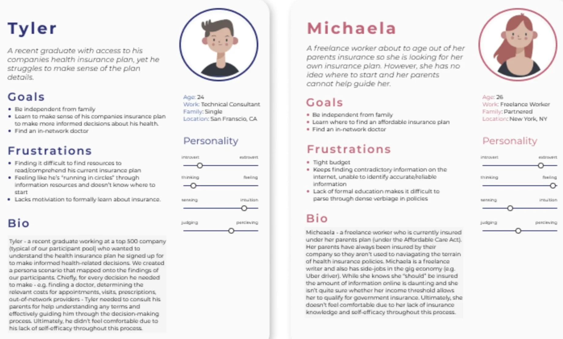
Thus, based on our survey results and contextual interviews our team devised the persona of Tyler — a recent graduate working at a top 500 company (typical of our participant pool) who wanted to understand the health insurance plan he signed up for to make informed health-related decisions. We created a persona scenario that mapped onto the findings of our participants. Chiefly, for every decision he needed to make — e.g. finding a doctor, determining the relevant costs for appointments, visits, prescriptions, out-of-network providers — Tyler needed to consult his parents for help understanding any terms and effectively guiding him through the decision-making process. Ultimately, he didn’t feel comfortable due to his lack of self-efficacy throughout this process.
However, when we presented our persona to our critique group we were, correctly, made aware of how atypical our persona was to the general United States population given the demographic profiles of our user interviews. While there are many students with access to care, there are many people (past the age of 26) without access to any form of health insurance.
Though we understood the limitations going into this user group we did believe that our findings would still highlight glaring problems in the health insurance space — namely, that policies were designed to be difficult to make sense of even to the most privileged.
However, we took our critique to heart and set out to find a low-cost solution to quickly generating qualitative insights of lay people and the pain points they experienced in regards to their health insurance. To do this we consulted Reddit.com, a popular microblogging platform to ask members of the r/HealthInsurance subreddit. Again, it’s worth mentioning that the demographic profile of a typical Reddit user tends to skew older, white, and male — however, it offered our team a small glimpse into reality outside the ivory tower. Surprisingly, we received many responses some of which chronicled issues of no-insurance and people misunderstanding what their plans offered.
The Personas
Problem Definition
Final People Problem
Students want the ability to better manage their health and seek care if they need it.
But they can’t do that well because:
They need help navigating the intricacies of the insurance process
They don’t know much about the health insurance realm
Thankfully, because we were able to expand the scope of our demographic pool we knew our final design intervention should include some mechanism to identify low-cost plans (and/or point users in the direction of government services if they qualify) as well as support them throughout their entire health insurance journey, not just the start of it.
Design & Implementation
Affinity Diagram
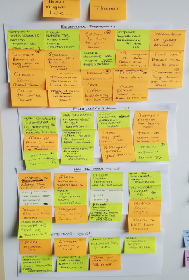
After our team had settled on the defined problem we began to ideate among five larger categories to generate How Might We’s (HMW), a design exercise focused on exploring the complete solution space, as we didn’t want to constrain the solution space to any particular category too early. The original five categories we wanted to focus on included: Search, Policy, Education, Infrastructure, and Decision-Making. Those initial HMW’s formed the basis of creating tangible solution plans — though we didn’t restrict any plan based on feasibility at this stage. We then generated an additional 100+ solution ideas based on the questions we asked in our HMW’s.
These solutions were then grouped into their respective themes in our affinity diagram. The final categories included: Efficacy (perceived & actual), user needs, limited understanding, information sources + reliability, future plans, and large-scale policy considerations.
Impact-Feasibility Matrix
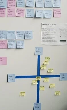
In an effort to evaluate more feasible solutions we developed a feasibility-impact matrix among the high-level solution patterns we identified. High-impact solutions included: human agents to walk people through every step of the process, chatbots to answer every possible question, and single-payer healthcare. Of the high-feasibility solutions these included: policy comparison tools, educational resources, personalized insurance plans, and redesigning government health insurance websites.
Thus, our team decided to only consider solutions that were both high-impact and high-feasibility in the context of a one-semester project course. Thus, we decided to create a platform to serve as a trusted resource guiding users through the dense verbiage of health insurance policies to ensure they understood what they were signing up for.
Design Goals
Something our team felt very strongly from the outset of this project was that the design intervention we would propose could have an immediate impact to improve the lives of people seeking health insurance or navigating their current plans. Thus, while our team did weigh heavily on policy-related solutions such as proposing a push for Medicare for All, we decided that policy suggestions were too far outside the scope of this project.
Our ultimate goal was to reduce the information asymmetry between customers and health insurance providers not only at the time of purchase, but throughout the lifecycle of the user’s health insurance journey. We believe an application as a service would best serve our users needs at-scale.
Information Architecture
Figure: Our sitemap is comprised around three core functions: 1) a personalized questionnaire, 2) a plan comparison chart, and 3) the individual policy’s plan details. This specific decision-tree serves as a high-level overview of the journey our users take to find and learn about the plan our service has chosen for them. This was suggested to us by an expert in behavioral economics & health policy as a flow to reduce choice overload and guide the user through the decision-making process whilst preserving their autonomy.
Design Concept
Introducing Edusure
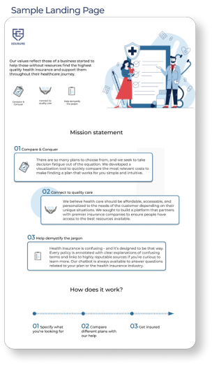
Edusure is our solution to connecting recent graduates to high-quality, affordable health insurance that best meets their unique needs. The platform was also designed to operate as a sustainable business model to sustain the brand’s mission. Below we detail our the mission statement and business plan for our design concept (Appendix 2.0 Brand Guidelines).
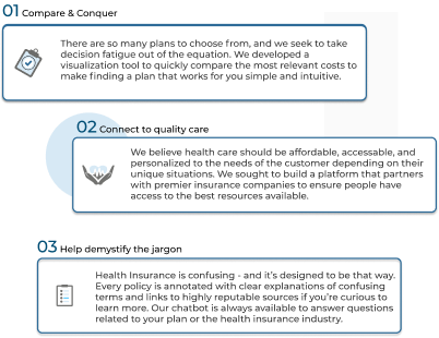
Edusure is a digital platform which also allows our user’s to learn about the intricacies of health insurance and the related terms to make better decisions. The platform is designed with privacy and transparency in mind to allow users to compare plans across a variety of insurance providers as well as help them make sense of their plans.
Even if you don’t use our service to purchase a plan, our educational guides are always available for free if you need to consult a trusted resource about health insurance.
Mission Statement
How does it work?
Specify what you’re looking for
Compare different health plans with our help
Get insured
Our Sustainable Business Model
Edusure operates as an insurance broker — which means we connect our user’s to existing health insurance companies. But we’re different from the rest. We focus solely on healthcare plans which are tuned via our algorithms and employees to best match our users with plans that fit their lifestyles.
We make the process of finding a plan, comparing plans, and learning about the details of the plan a unified & fluid experience. We aim to promote transparency in the process by showing all the plans/quotes we’ve identified for you, and help demystify the jargon to help you make the best decision. We also don’t save any information about our customers, so you can shop around without fear of being tracked/contacted while exploring different plans.
We put people before profits so we’ve designed our business around the core-value of connecting people to the highest quality of care.
As such, while we do make money on commission we’ve taken some steps to mitigate any conflicts of interest.
If you qualify for government assistance, for example, Medicare or Medicaid, we’ll direct you resources to apply for a subsidized or free health insurance plan. Otherwise, we’ll try to suggest plans within the price range you specify.
We make a small percentage off the annual cost of your health insurance plan, however, this price is built into the cost of the plan. Our employees are salaried so there is no incentive to upcharge you for a more expensive plan.
While it’s illegal to charge different prices for the same plan from the same insurance companies, different insurance companies will compete to offer similar plans. By using us we help you compare plans across the market to make sure you get the best price. We are committed to ensuring our users are supported throughout the lifecycle of the health insurance process, not just purchasing a plan. Once you’ve found a plan our service can help you better make sense of your plan, connect you to a doctor, or get help the next time around.
User Flow
Onboarding
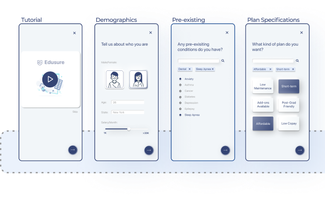
The type of plan one should purchase is dependent on a range of factors from: age, location, current primary care physician, income level, pre-existing conditions, premium/deductible expectations, etc. As such, when a user enters our onboarding flow we present them with an informational video which communicates our brand’s mission while also taking users through the basics of obtaining health insurance. To note, we never solicit the user’s name or contact information during this process to ensure their information is never communicated/sold to insurance companies. Then we guide them through a series of questions to identify the best plan for them (design goals 1 & 4).
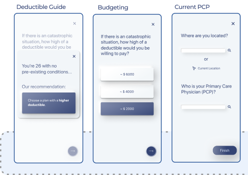
The onboarding flow also helps make the user more aware of the risk of not having an insurance plan by prompting them to consider the deductible that might be best for them, especially in the case of an emergency. Based on the user’s pre-existing conditions and age Edusure makes a recommendation for the deductible rate (i.e. it’s usually recommended that if a patient is young with no pre-existing conditions to get a plan with a higher deductible and lower monthly premium).
Moreover, we also ask for the user to specify there location and if they have an existing Primary Care Physician (PCP) such that our system can try and match them with policies which include their current doctor as in-network. Moreover, this tool helps identify which insurance companies are more widely accepted in a given area.
Learning Center
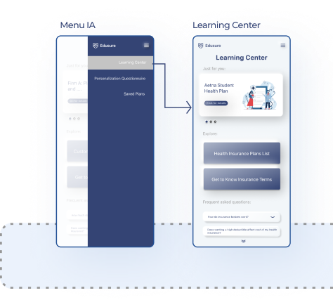
The Learning Center is at the core of our design’s mission to support users throughout the lifecycle of their insurance journey. As such, the learning center includes sections for exploring the health insurance companies Edusure partner’s with, as well as a glossary of the important insurance terms. Moreover, we include a section on frequently asked questions which seeks to demystify the process of navigating the insurance landscape in a down-to-earth, very digestible manner.
Plan Comparison
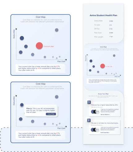
After the onboarding process the user will be presented with the recommended plan (highlighted in red) along with 5–10 other plans which we believe might also suit their needs. The recommended plan is pinned to the top with key cost metrics (e.g. e.g. deductible, co-pay, ER fee, plan cost, and plan length).
The “Cost Map” compares these plans across the two dimensions most frequently cited for considering health insurance — total deductible (out-of-pocket costs) and the monthly plan cost (monthly premium). The user can touch on another suggested plan to reveal the primary differentiator and choose to view that plan’s policy information/costs. We provide the user with structured information below about why we choose this particular policy for them. This feature directly address design goals (1, 3, 5) which relate to comparing plans, and providing transparent cost information.
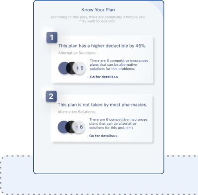
Additionally, as the user scrolls down on the comparison page we present the “Know Your Policy” section. Here we communicate any “warnings” our system detects based on the demographic information provided in the onboarding process. For instance, if you mention a pre-existing condition Edusure might note that we choose a specific plan because there’s a lower co-pay since the user might need to go in for treatment more regularly (design goals 3, and 5).
Understanding Your Policy
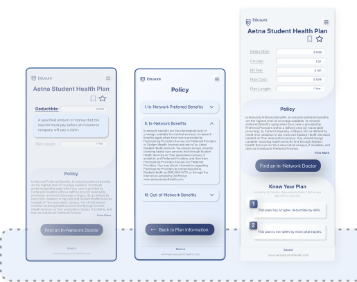
If a user wants to learn more about the plan we selected for them, touching the title will take them to a dedicated flow to dive into the plan specifics. Under the policy section users can see a detailed policy breakdown, with scaffolded information, nested in dropdown menus. If a term of process is unfamiliar to the user taping on a highlighted term will pull up a card with the definition. Moreover, from the plan user’s can identify doctors in-network from a variety of specialties so they’re confident they won’t be hit with out-of-network fees (design goals 2, 4, and 5).
Evaluation
Evaluation Goals
The overarching goals we hope to explore in our evaluation stage is to conduct a feature prioritization to ensure that our solution addresses our original people problem. As such, among our current features to find/compare plans, learn about health insurance, and find a doctor — we want to ensure these features will truly yield value for our users. Moreover, we want to explore any potential negative externalities generated from our platform to inform our high-fidelity prototype. We include our semi-structured interview protocol in the appendix (Appendix 3.0).
Clinical Trial Specialist
Our expert is adjacent to the healthcare space and works closely with insurance companies to get clinical trials related to HIV medication off the ground. This means that she interfaces with patients who need to find, evaluate, and learn about their insurance plans. We consulted with her to determine whether or not our design solution was tackling the right problems. While she loved the concept of connecting uninsured users with a plan, she felt strongly that many people who have plans lack the necessary skills to actually use them.
As such, she suggested we make the process of learning about the existing plan more robust. This resulted in our policy flow — which was updated to include scaffolded information as well as terminology assistance built-in to the reading experience. Moreover, we also included a list of insurance companies in the learning center so user’s can learn more about their provider.
Human Development Professor
Dr. Corinna Loeckenhoff is a joint professor in human development as well as an associate professor in gerontology in medicine at Weill Cornell Medical College. She has published research in healthcare decision-making — and we consulted her expertise to ensure our solution will actually help user’s make sense of complicated insurance/policy information. Her feedback was instrumental to expanding our existing onboarding flow. Specifically, she argued that newcomers needed a primer on the general structure of health insurance before they started making decisions which lead to the creation of the onboarding video users would watch prior to inputting their information. Moreover, she suggested we make improvements to the comparison flow to better explain “why” we choose the plan we did — such that user’s could better understand the tradeoffs among premiums vs. deductibles/out-of-pocket costs.
User-Experience Designer
We wanted the feedback of a UX designer that was not in our immediate social circle to reduce bias. We sought her to help us better develop a more robust interaction flow for the onboarding, comparison, and policy screens. Our expert ran a heuristic evaluation in which she critiqued our platform via Nielsen/Norman usability principles. Moreover, we solicited feedback on the various affordances/visual metaphors to ensure our application was as intuitive as possible. She was responsible for guiding the art direction for our high-fidelity prototypes and suggesting illustration libraries which defined the look and feel of Edusure.
Usability Testing
In an effort to ensure the usability of our design concept, we recruited recent graduates (n=6) to run a virtual usability session. We prepared three scenarios which users were to walk through — one on the onboarding flow, the comparison flow, and policy flow (Appendix 4.0). We found that averaged across each micro-interaction we had a 94% success rate across all of our features. There was some minor confusion about selection in the comparison flow — which led to our team adding a stroke-weight on selected circles. Additionally, it wasn’t originally clear how to navigate to the “Know Your Policy” section, which our team addressed by increasing the size of the artboard to allow for a more high-fidelity interaction via scrolling. We re-tested this visual design update and found that users were much more comfortable navigating our prototype. Please refer to the Appendix for the findings of our usability testing sessions.
Discussion & Conclusion
Discussion
In all, our team is incredibly pleased with our final design concept. We designed Edusure as a trustworthy platform to guide users through the complicated decision-making process of choosing a health insurance plan. While we don’t “dumb” the information down, we support our user’s where they are to help them become fluent in their plans features. Moreover, our goal was to create a platform to connect as many people to insurance since the cost of not having insurance could be catastrophic for many Americans. While we weren’t able to actually build/pilot our design, we believe this case-study can serve as a template for a future insurance company — one built on the virtues of trust, transparency, support, and compassion. For our team specifically, this was our first foray into working on an insurance product — and there are surely some details we missed — but we’ve learned so much about the human-centered design process and creating a sustainable product that truly makes the world a better place.
Future Implications
Widespread user testing to better assess the product-market fit
Partnering with insurance companies to draft standards for inputting cost data into our application — i.e. work on the UX from the perspective of managing the company internally
Develop machine learning (ML) algorithms to test the effectiveness of matching plans
Design and build a web version of Edusure since our experts believed that many insurance sales occur on a desktop/tablet interface.
Understand how to better integrate our product with governmental services (e.g. Medicare, Medicaid)
Explore how to best incorporate news about the healthcare industry in the Learning Center
Conclusion
While we set-out to originally design a solution for recent college graduates looking to better understand their health insurance plans, our team believes strongly that our platform has the ability to help millions more Americans find plans that better suit their needs & understand the plans they already possess. By focusing on designing for a marginal population those same designs can greatly benefit those in the majority as well [15]. While we acknowledge that recent college graduates were more likely to already have a health insurance plan, they still perceived their self-efficacy to use their plan to be low — as such, by addressing this information gap we ultimately designed something for insurance novices that can be applied to many different populations.
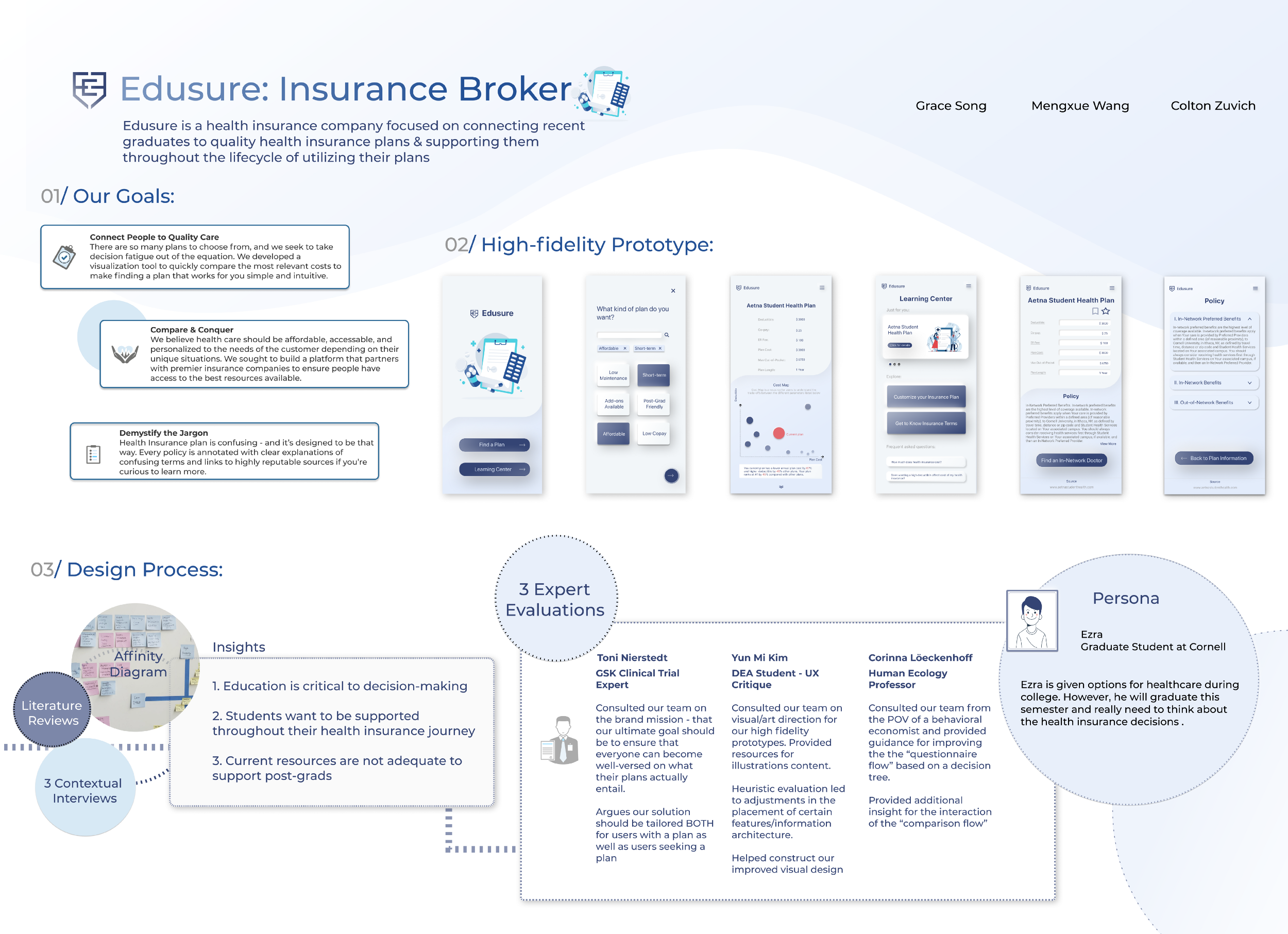
Final Poster
References & Appendix: https://www.figma.com/file/t1kIHX30riW2B6rGtF9ttA/Wall?node-id=315%3A3617
Figma Prototype Link: https://www.figma.com/file/t1kIHX30riW2B6rGtF9ttA/Wall?node-id=256%3A6418


