Cornell’s Postgraduate Statistics
Analyzing visualizations of Cornell’s postgraduate survey data using d3.js.
Logistics
Course: INFO 5100 Visual Data Analytics for the Web
Team Members: Grace Song, Jerry Xu, Zhongkai Liu
My Roles: Coding, Data Retrieval, JSON File Creation
Overview
The goal of this project was to create a non-interactive data visualization using d3.js to understand and analyze a large dataset of our choosing. We decided to analyze Cornell’s postgraduate survey results, focusing on the Information Science undergraduate, Information Science graduate, Computer Science undergraduate, and Computer Science graduate students.
Description of the Data
The data used for this project was pulled from the postgraduate survey page of the Cornell University Career Services website. The available filters on ‘Year of Graduation’, ‘Degree Level’, ‘Location’, and ‘Major’ were applied to refine the resulting student counts. In the JSON file that was generated from this information, each object corresponds to a specific degree level (Bachelors or Masters), major (IS or CS), and graduation year. We utilized all available data from the website, which spanned the years 2012 to 2018. One peculiarity in our data set was that we did not have a value for the number of students who graduated in 2014 with a Masters degree in Information Science; we imputed this particular value by averaging the corresponding numbers from 2013 and 2015.
Our Visualization’s Story
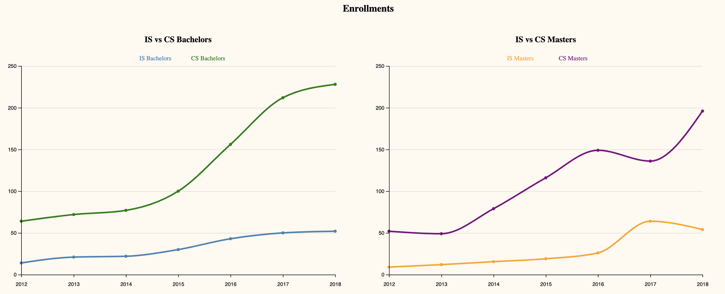
The enrollment line graphs give insight into the trends for the number of students pursuing degrees in Computer Science and Information Science. The number of students studying Computer Science has rapidly and consistently increased every year, at both the Bachelors and Masters level. Information Science, in comparison, has relatively few students at either degree level. Enrollment in the Information Science department has furthermore only increased slightly from year to year.
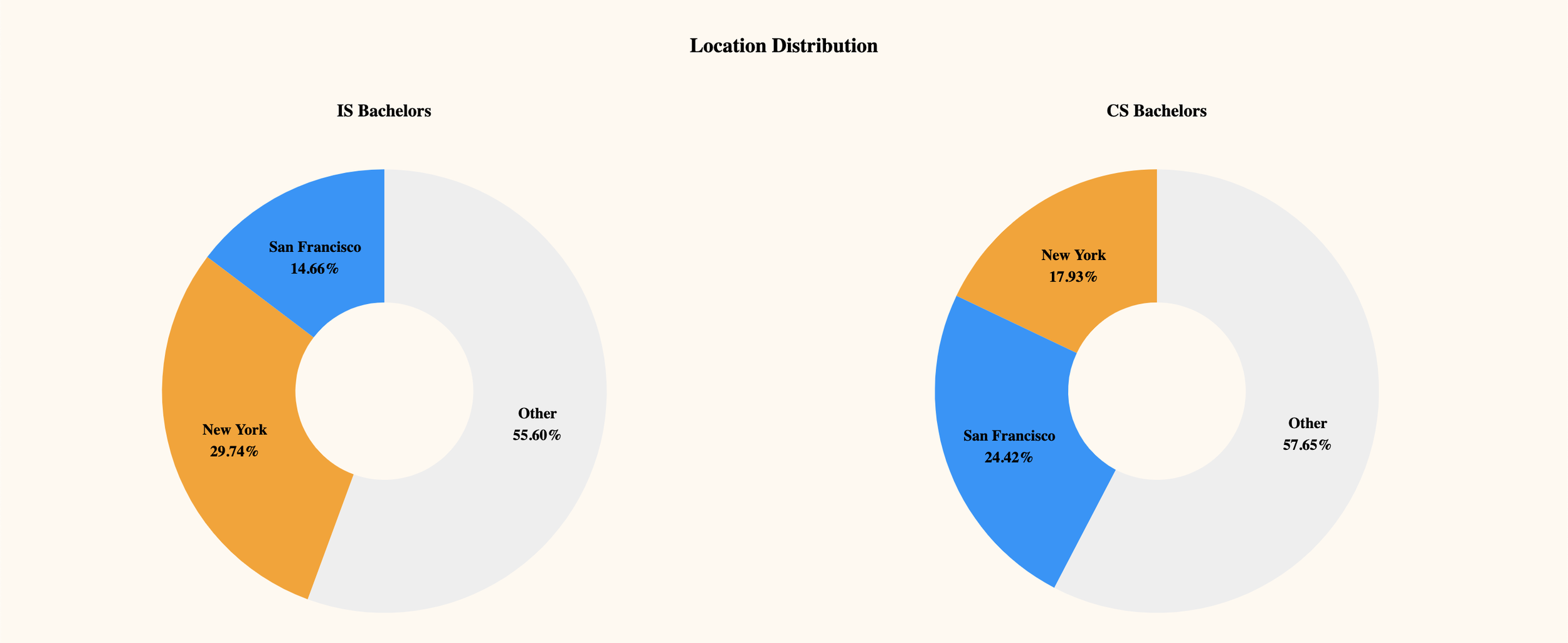
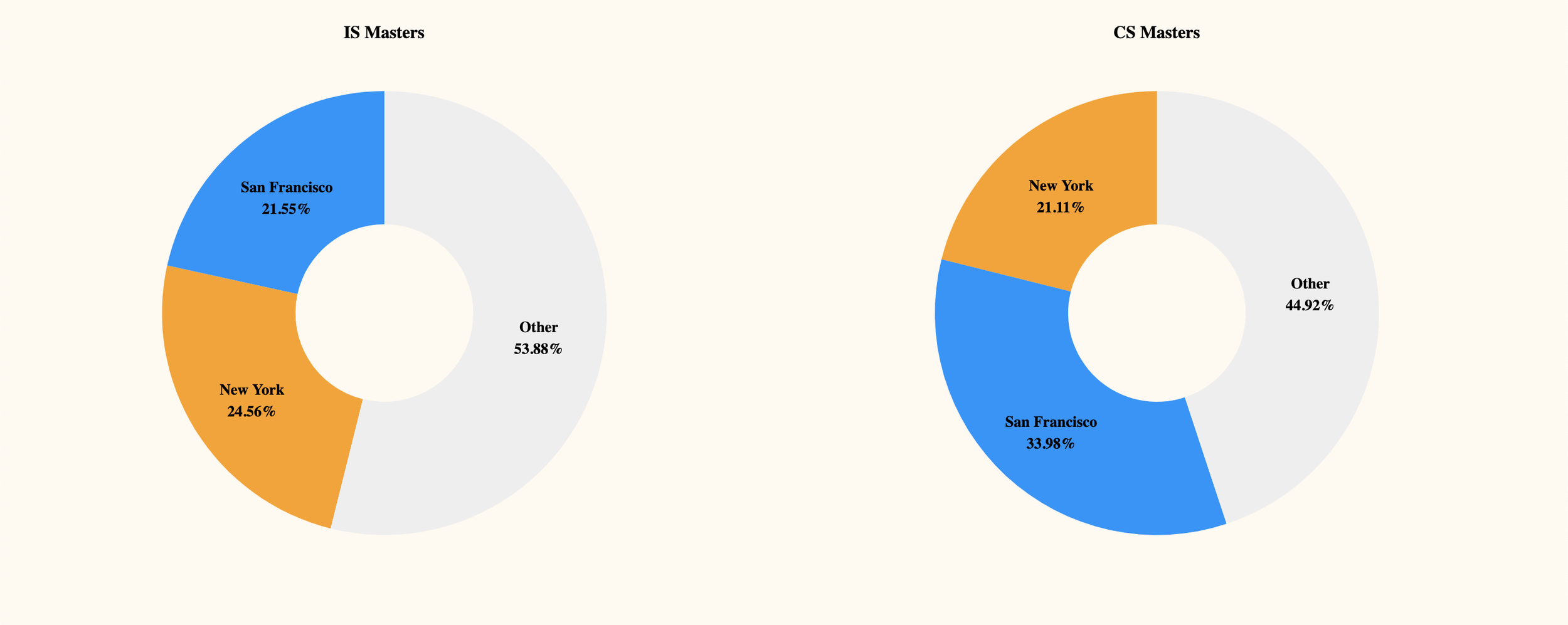
The donut chart provides insight into the location preferences for IS and CS students. Reportedly, students in the IS and CS majors have higher preference for New York and San Francisco and we wanted to show data that reflects that verbal statement. New York and San Francisco also tend to have a higher cost of living and average income in comparison to other areas, which may also influence the earning power of graduates. According to the charts, there is a higher preference for New York and San Francisco across both majors, and we assumed that this is due to the high growth of the technology industry in both areas. The charts also show that there is a higher percentage of CS majors in San Francisco. We were actually surprised to see that the difference in location preference for both majors were small. We believed that there would be a significantly strong preference for San Francisco over New York, due to the nature of each environment — New York being the financial capital of the US and San Francisco having a strong established technological environment. Because of this, we were able to conclude that technology opportunities are equally available in both regions and that some IS and CS majors may find career opportunities outside of the technological realm.
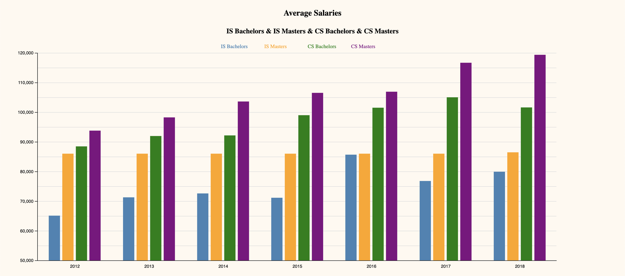
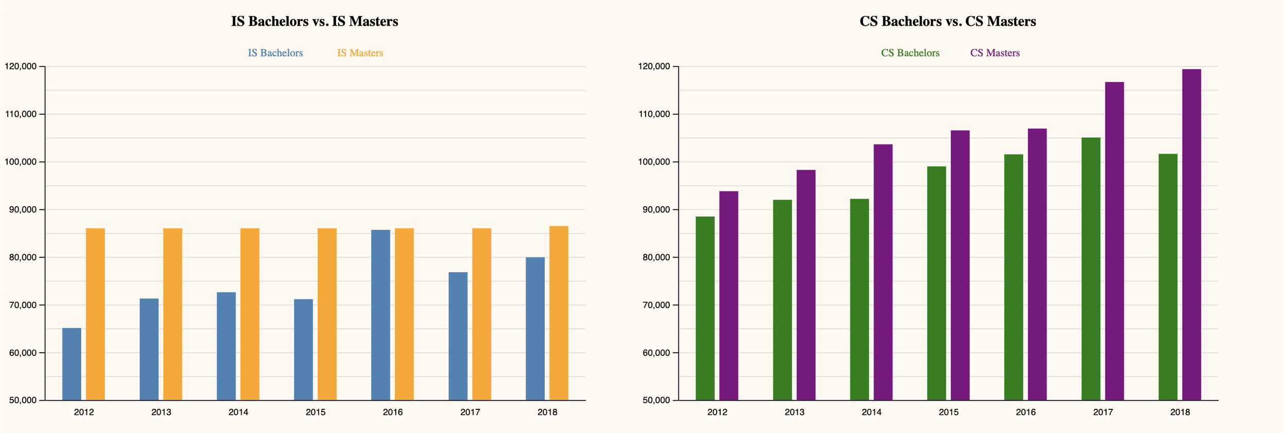
From the average salary bar charts, it is apparent that higher levels of education unsurprisingly corresponded to higher earning power. The difference in average salary between students who studied Information Science and students who studied Computer Science, however, was larger than expected. Students who graduated with Bachelors degrees consistently out-earned even students with Masters degrees in Information Science.
On a year-to-year basis, the average salary for those with Bachelors or Masters degrees in Computer Science consistently increased. The average salary for Bachelors or Masters degrees in Information Science, on the other hand, remained stagnant or fluctuated slightly. To a surprising extent, the trend in number of students majoring in Information Science or Computer Science over time follows nearly the same trends seen in average salary for the two majors; while the number of students studying Computer Science consistently increases, the number of students in Information Science remains stagnant with only small fluctuations. The trend in enrollment is more clearly seen in the line graph for IS/CS Bachelors enrollment than it is in the line graph for IS/CS Masters enrollment, probably because there are significantly more students pursuing Bachelors degrees than Masters degrees.
Design Rationale
The first part of our visualization demonstrates the number of students majoring in Information Science and Computer Science over the past few years. We felt that line graphs best convey the data here because we are trying to show the change in numbers over time. We also chose to separate this information based on degree (Masters or Bachelors) in order to see if there were different trends between the different levels of education.
The second part of our visualization includes four donut charts. The four charts show the percentage of postgraduate students in different locations for IS Bachelors, CS Bachelors, IS Masters, and CS Masters. We decided to go with the donut chart because it is the easiest medium to view percentage data. We also decided to go with the donut chart rather than a pie chart because the donut chart does not have a distinct central point of attraction, thus allowing viewers to focus on the length of each slice of data (length corresponds to the percentage data). We decided to separate the data into three categories based on students’ typical location preferences: New York, San Francisco and Other. For comparison purposes, we arranged the charts side-by-side and in pairs based on degree type (“IS Bachelors” and “CS Bachelors) and (“IS Masters” and “CS Masters”). The donut chart consists of three different colors. We decided to use the colors orange, blue, and light grey to mimic the colors of the Computing and Information Science department at Cornell — so in addition to distinguishing the different slices, the charts show their correlation to the data (IS and CS are within the Computing and Information Science department). Because the font was placed on the individual slices, we made sure to bold the text for better visibility.
Lastly, our visualization includes five bar charts; the first chart is meant to give a big picture visualization of the earning power between all four groups by placing their corresponding bars next to each other. The following four charts, placed below to display drill-down information, are arranged side-by-side and in pairs in order to focus on the salary differences for different levels of education and for different majors. We intended to focus on conveying the differences in earning power based solely on level of education in the first pair of charts (“Average Salary IS Bachelors vs IS Masters” and “Average Salary CS Bachelors vs CS Masters”) by placing them next to each other and on the same scale. The second pair of charts (“Average Salary IS Bachelors vs CS Bachelors” and “Average Salary IS Masters vs CS Masters”) are similarly placed next to each other and on the same scale in order to demonstrate the difference in earning power between IS and CS majors.
We chose distinctive colors that did not have a natural ordering for each of the four groups (CS Bachelors, CS Masters, IS Bachelors, IS Masters). We also opted to use hard-coded scales in the bar charts and line graphs because we felt it was important to have some spacing at the top of each graph, and because distinctions in salary were not clear when the income in the bar charts started at 0.


