Notewardy
A web application design for a new edtech startup.
Logistics
Course: MPS Practicum
Team Members: Grace Song, Ally Yuan, Chloe Wang, Michael Huang, Yiwei Sun
My Role: UX Researcher & Product Designer
Project Overview: The Problem
This semester, our team was tasked with designing an application to enhance the note-taking and studying experience for students. Our clients’ idea for the application, Notewardy, was a tool that would enhance these experiences by using optical character recognition (OCR) technology to simplify the note-taking process, and spaced repetition methods to improve studying. With this in mind, our team conducted user research to better understand students’ needs in this space, as well as how the application should be designed to address those needs.
User Research
The user research, aimed at measuring students’ note-taking and study habits, was split into two parts: (1) individual contextual interviews conducted by members of our team and (2) a user survey that was sent out to various communities within the U.S. college ecosystem.
Contextual Interviews
Before asking more specific questions about students’ note-taking and study habits, we wanted to get a better understanding of the problem space. We created an interview protocol that consisted of five different sections: introduction, general study/note-taking habits, note-taking scenarios, existing note-taking workflow, and note-taking & group studying. It was important for us to have all five sections integrated into our protocol, since we wanted a more holistic view of what this problem space entails, as note-taking and study habits differ on an individual basis.
Each team member was tasked with interviewing 1–2 participants for this portion of the user research. The data collected from these interviews were used as a basis to narrow the scope of the target audience and figure out the types of questions we should be asking for the qualtrics survey.
Survey
Based on the contextual interviews, we narrowed the scope of our audience to undergraduate and graduate students. We found that it was difficult to understand the plethora of note-taking/study habits because on top of it differing on an individual basis — we found that the area of study affected the way students study and take notes. Additionally, we found that our research was very limited because we had interviewed people within only the Cornell University community.
To better understand this space and get a wider range of data, we decided it was crucial to gather qualitative data from the surveys and expand our research to undergraduate and graduate students at other universities as well. We compiled a list of important questions and coordinated with the professor and our clients to structure the survey and ask the appropriate questions for our research.
The platform used for the survey is Qualtrics. We believe that Qualtrics was the best platform to conduct the survey research because of how simple it is to aggregate all of the data and be able to analyze the data with ease
Data Analysis
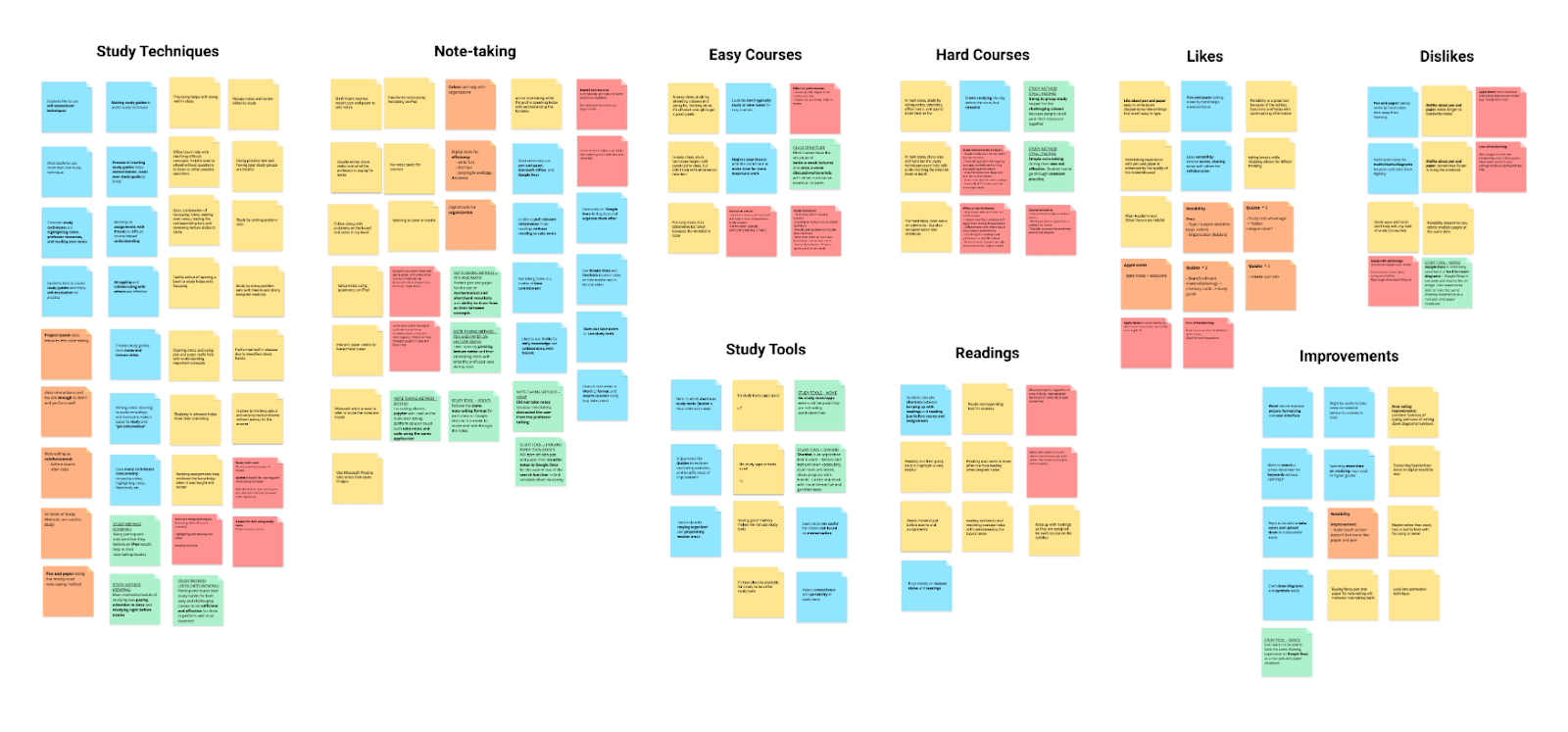
Once our team completed the user research phase, we consolidated the data collected from the Qualtrics survey to perform data analysis. We were able to obtain several survey responses, and our team decided to take a sample of ~30 to analyze, per instructor recommendation. The team split 35 survey responses evenly, so each team member analyzed 7 responses and documented themes, trends, and interesting insights on sticky notes in a shared Figma file. After this, the team collectively organized our individual notes into an affinity diagram.
Our affinity diagram revealed key insights around different areas of the problem space, including note-taking behaviors and tools, study behaviors and tools, and how those behaviors and tools changed in the context of easy and challenging courses. The summary of the key takeaways are as follows:
Most students don’t seem to use study tools: generally, students follow their own processes for studying, and rely on few external tools, especially when studying does not explicitly involve memorization. For memorization-based studying, Quizlet was a popular option.
Most students take notes via pen & paper: while there are a variety of digital tools that students have explored (Google Docs, Microsoft Word and OneNote), students generally prefer the physical act of writing to support information retention, even though it may be slow and inefficient at times.
The most recurring study technique was some form of self-assessment: this includes creating study guides, taking practice tests, etc. Other common techniques included reviewing lecture slides/course materials and recopying notes.
For note-taking, students would like to make the process faster, with better organization for later retrieval and review of specific information.
Preliminary Design
Brainstorming
After consolidating insights from the affinity diagram, we spent some time collaboratively brainstorming ideas for design concepts and features that would address some of the salient behaviors and needs we uncovered.
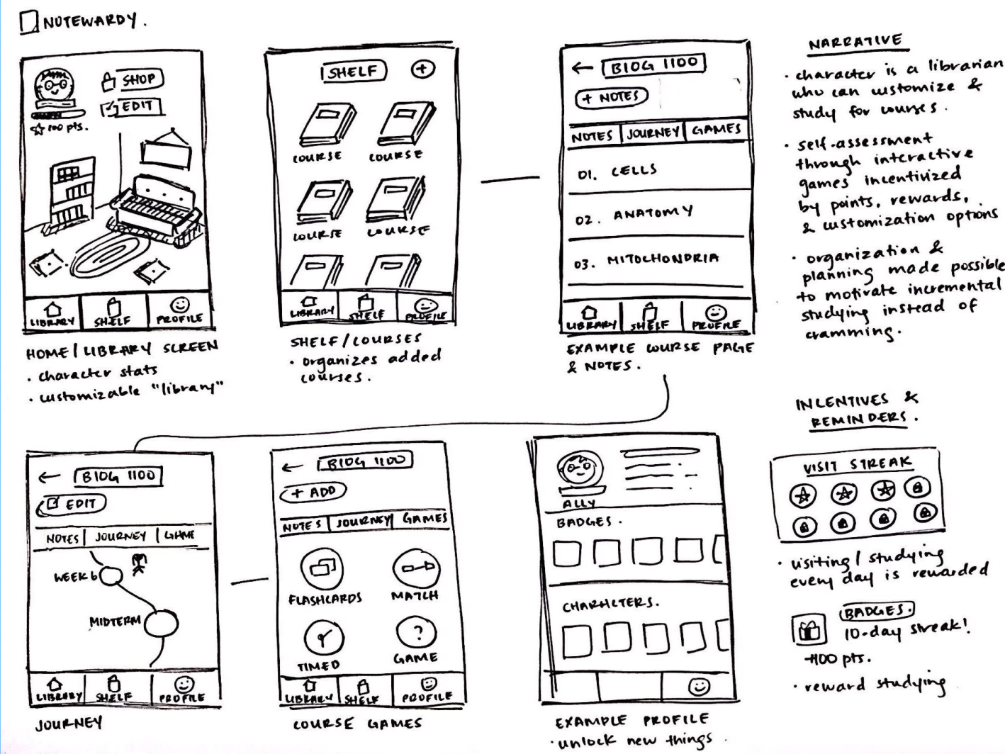
The team came up with two promising concepts: (1) involving flashcards and self-assessment and (2) involving gamification of the note-taking and studying process.
Sketches
To present these ideas to our clients and provided a better mental image of the functionality, the team created sketches of the two concepts. We presented these to our clients in order to receive early-stage feedback about our design direction, as well as their thoughts about any features that were especially important or not necessary.
Low-Fidelity Prototype
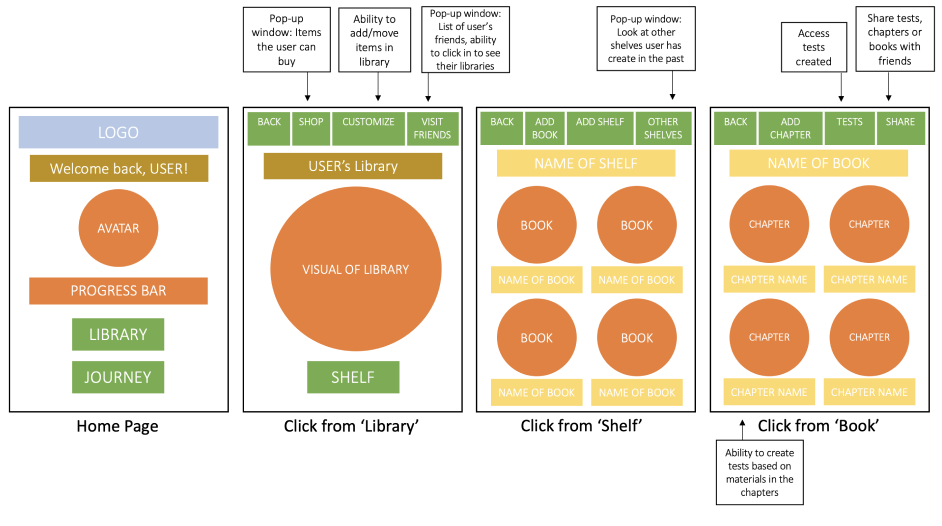
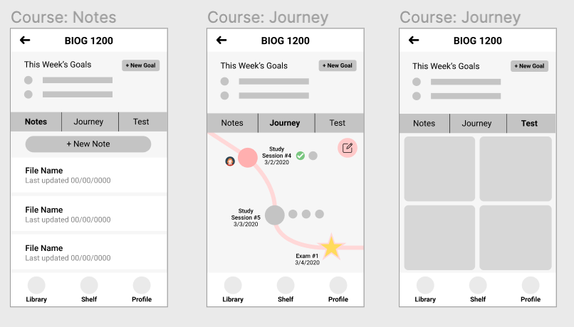
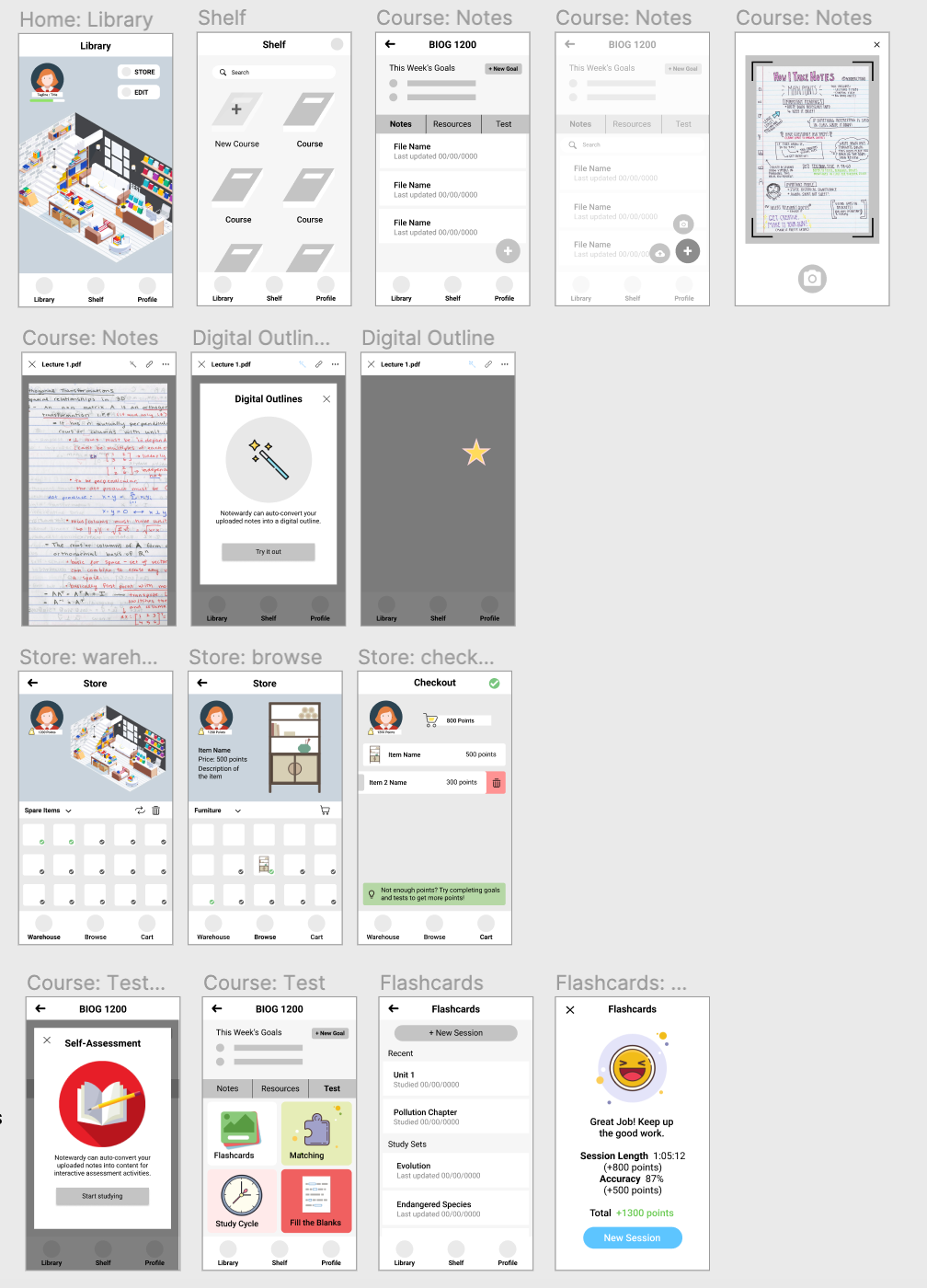
Based on clients’ feedback on our initial sketches, we translated the sketches into low-fidelity prototypes to better visualize and map out the flow of our design. In doing so, we determined key feature and content requirements to include. Our first iteration took the form factor of mobile, as we had initially thought that designing from a mobile-first approach would scale better.
User Testing
We conducted usability tests on our low-fidelity prototype to gather further feedback from the users. We created 5 tasks for the participants regarding the features we considered for the application. The tasks are listed below:
Adding a course and then a note for that course with camera
Looking for a past note in an existing course
Studying a topic in a course via Flashcards
Buying item to customize Library
Looking for an outline or an external resource under an existing topic
Five usability tests were conducted during a period of two days. All participants were college students studying various majors, which correspond with our targeted user group. The findings revealed some common issues in our low-fidelity prototype: First, the navigation throughout the application was not intuitive due to the library metaphor and the terminology we used for certain features. Second, the missing explanation made the application confusing to the users. Lastly, the placement of certain features were not intuitive for use. For example, the flashcards feature was under the self-assessing tab but it was actually for reviewing materials. The participants also suggested that a sharing profile feature and a more interactive home page / more gamification elements could incentivize the user to gain points.
Design Iteration
Mid-Fidelity Wireframes
Using the feedback we received from the user testing, the team updated the prototypes to incorporate the necessary features for the application. At this point, we were also trying to figure out how we would incorporate the paper-to-digital notes component of the application. We decided to create an option, where users could take pictures of their notes and upload them to Notewardy or they could upload a file from Google Drive, image gallery, and their device’s file storage.
Once we created the mid-fidelity prototype, the team was stuck because the mobile application seemed to interfere with the important features of Notewardy’s application. To confirm this issue, we did another round of user testing — which showed that people prefer to use a web form factor for reviewing and studying because the size of a mobile screen was too small for these text-based processes.
We collectively decided to inform the clients of this issue and asked the clients for permission to switch the platform on which the application will reside. Once we got confirmation from the clients, we decided to change the focus from the mobile application design into a high-fidelity prototype for a web application for the rest of the project.
High Fidelity Mockups
Finally, our team converted the mockups into high fidelity, taking feedback from the clients and, as mentioned above, changing the form factor to web. We decided that having a progressive web app for the initial design would be beneficial because it fits better with users’ note-taking and study workflows (as revealed by user testing) and is a better fit for the clients’ development skills for actually coding out the application.
Full Interactive Prototype here.
Design Documentation
In response to the user testing and client feedback, our high fidelity mockups are composed of the following features:
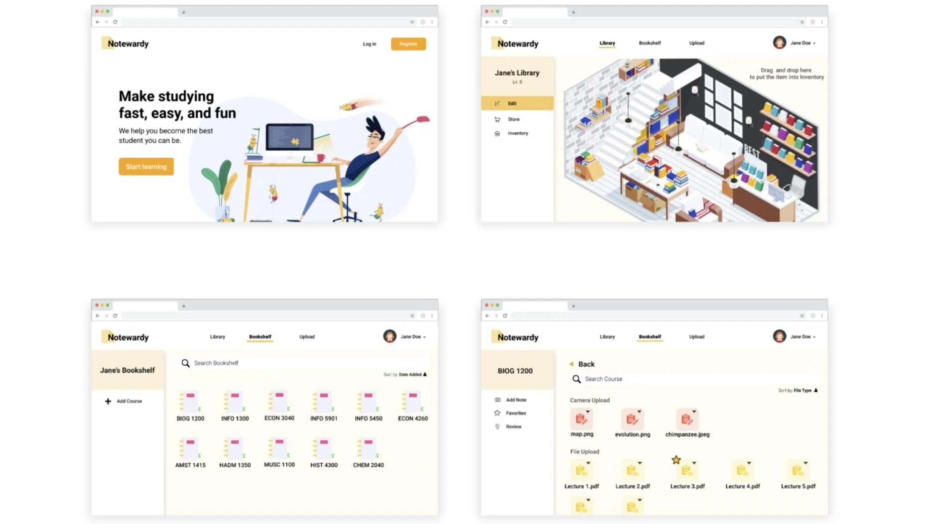
Home. Our design aims to create a more enjoyable study experience for students by creating a narrative around it. Students are librarians who want to earn points by completing learning activities to customize their digital library. This is introduced in the home page where the terminology, narrative, and technical features are introduced.
Library. This is where students see their library, access the shop, redeem their points for new items, and customize their layouts. The opportunity for creativity is a great incentive for students and imparts a more exciting experience.
Bookshelf. This is where students add their courses and subsequent notes. The “bookshelf” is part of the narrative and allows students to organize their course materials depending on their own personal preferences.
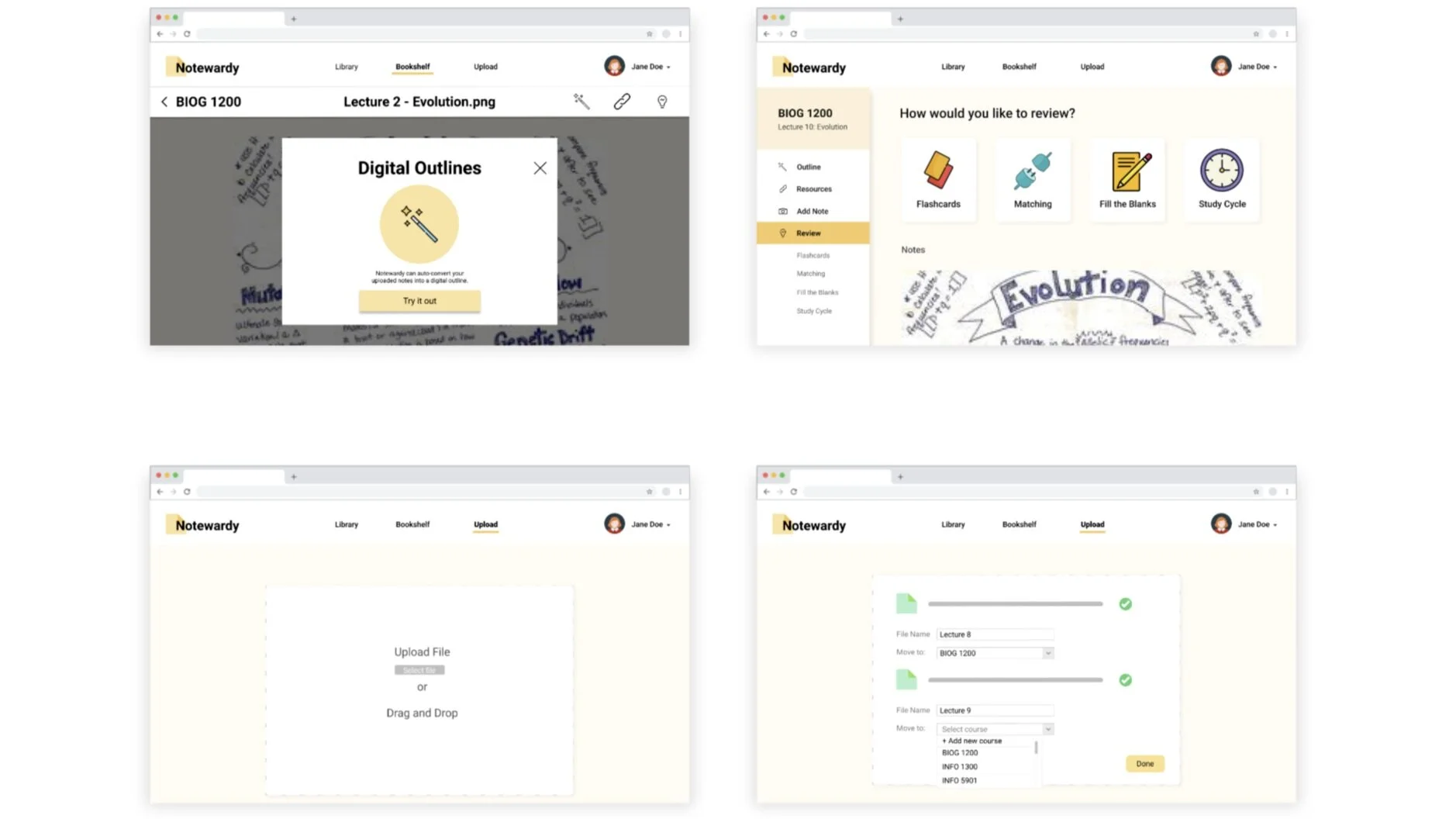
Upload. This is where students can upload their notes, whether this be by file upload, dragging and dropping, or using third-party applications like Dropbox or Google Drive. Notewardy uses these notes to then create digital outlines, collect external resources, and populate learning activity content.
Notes. This is where students can access their notes, outlines, favorite material, and external resources. It allows students to organize their notes in their respective courses and focus on practicing these different concepts.
Digital Outlines. As part of Notewardy’s value add, the platform takes uploaded notes and organizes them into digital outlines. This is particularly useful for students who may take messy notes or have disorganized material.
External Resources. Collecting resources from the web and other databases make the experience much easier for students as they can just research and review these different sources for more information on their learning material.
Review. This is where students can complete learning activities: flashcards, matching, filling the blanks, and study cycle. Our user research indicates that students really enjoy using self-assessment as a way to practice and better understand material. By allowing students to review specific content in an intuitive, convenient, and effective way, students are more prepared.
Future Work
Future work for Notewardy will likely involve more rigorous user testing, as we were constrained to 5 users due to difficulties of coordinating sessions amid COVID-19. Additionally, some of the features proposed in our design function at the most basic level, so may appear redundant at first for some users. This was intentional to make the MVP easier to implement and validate, but future iterations of the design and code would allow for more built-out features. With the implementation of a functional prototype, Notewardy should consider creating more assets for the application including the explanatory illustrations and the library items and testing the user attitude based on an interactive model.
Some opportunities for expansion include:
Study Folders. Currently we allow students to study individually uploaded notes, however, a big improvement would be allowing students to customize their studying experience by indicating what sets of notes they would like to study at a time. This could even expand into entire courses.
Community Aspect. Some participants from user testing indicated an interest in the competitive spirit of the application. They wanted to connect with their friends on the platform and view their libraries and gain access to their study resources. This could bring a great social and sharing aspect to Notewardy.
Innovative Games and Activities. The platform currently has standard learning activities like flashcards, matching, and filling in the blanks. There’s a big opportunity for expansion regarding new ways to portray information and interactive ways to assess students beyond memorization and a traditional model of the student.
Helpful links: the team got inspiration from Quizlet, Fuse, and productivity apps.


